Research, UX Architecture, design system creation, competitive analysisSimplifying tax compliance for the American trucker
Role: Lead UX Designer & Researcher
Outcome: Eliminated the "shoebox of receipts" workflow & optimized data entry for non-technical users.
The ProblemTax season was a manual, paper-heavy nightmare. Truckers spent countless hours managing physical receipts for fuel and maintenance. The existing process was cumbersome and prone to error, leading to overwhelmed accountants at ATBS.
The Friction: Truckers have limited downtime and varying levels of digital literacy.
The Risk: Lost receipts meant missed deductions and potential audit liabilities.
The Reality: The "office" is a cramped truck cabin, often moving or parked in low-light conditions.
The StrategyBuild for the environment, not just the task. I didn't just digitize a form; I designed for the physical constraints of the road.
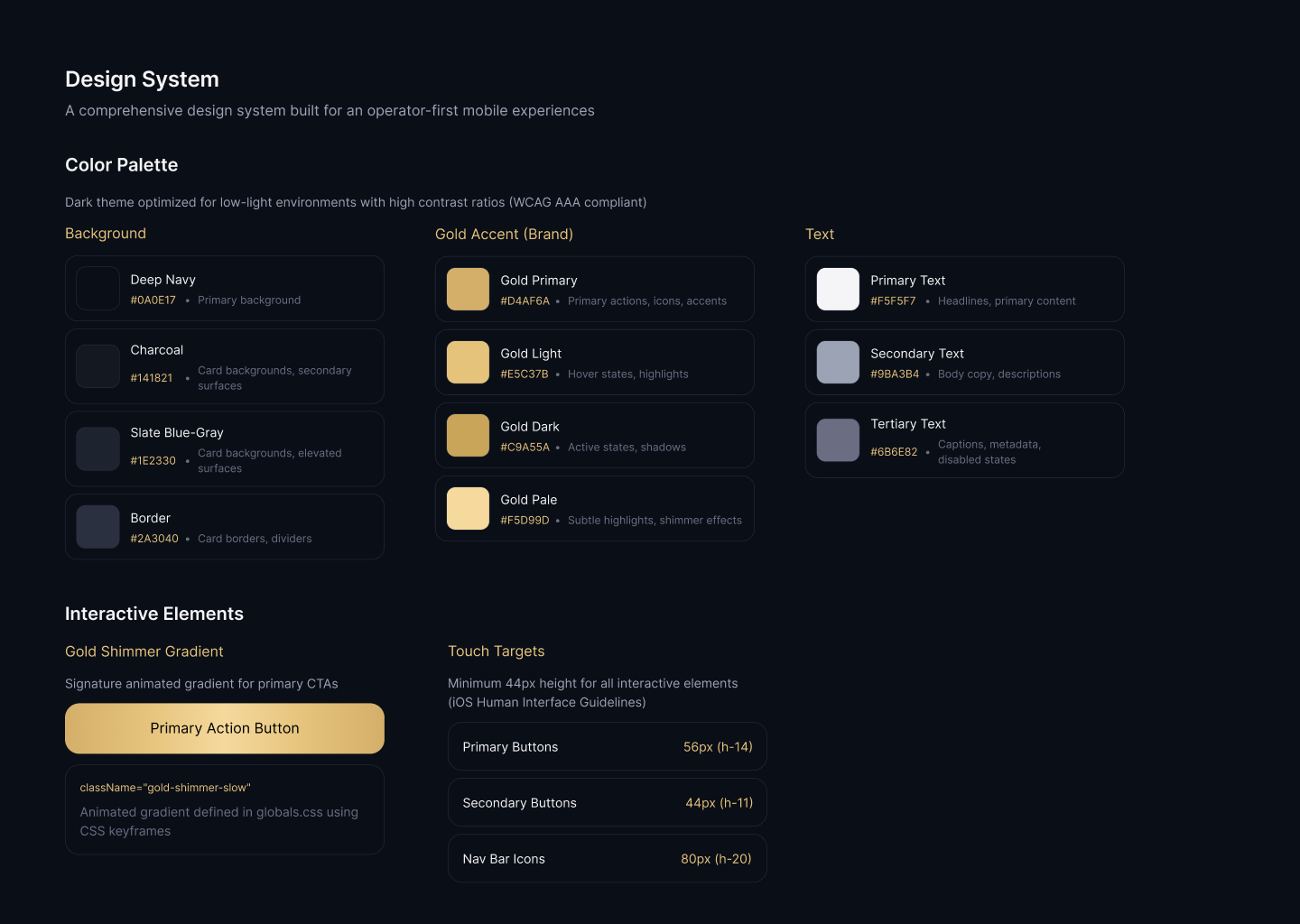
Accessibility as Default: Large touch targets and high-contrast visuals accommodated glove usage and night driving.
Speed over Precision: Replaced manual text entry with OCR and smart defaults to reduce input friction.
Trust through Feedback: Provided instant visual confirmation and cloud backup to replace the tactile security of a paper receipt.
Financial services app design / Trucking industry mobile app / Tax services app UX / Professional services mobile designResearch & Discovery
Understanding the Users
Through stakeholder interviews and user research, I identified key pain points:
Time Constraints: Truckers have limited downtime and need quick, efficient solutions
Physical Receipt Management: Paper receipts get lost, damaged, or forgotten
Tax Compliance: Missing receipts mean lost deductions and potential audit issues
Technology Adoption: Varying levels of digital literacy among users
Competitive Analysis
I analyzed competing solutions in the market, identifying opportunities where ATBS could differentiate:
Ease of Use: Most competitors had complex interfaces not optimized for on-the-go use
Speed: Existing apps required multiple steps to capture and categorize receipts
Integration: Limited connectivity with accounting and tax preparation services
Design Process
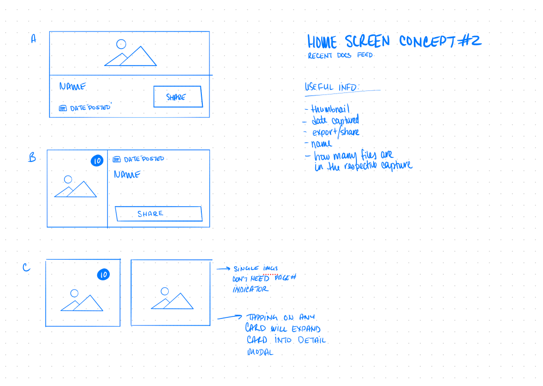
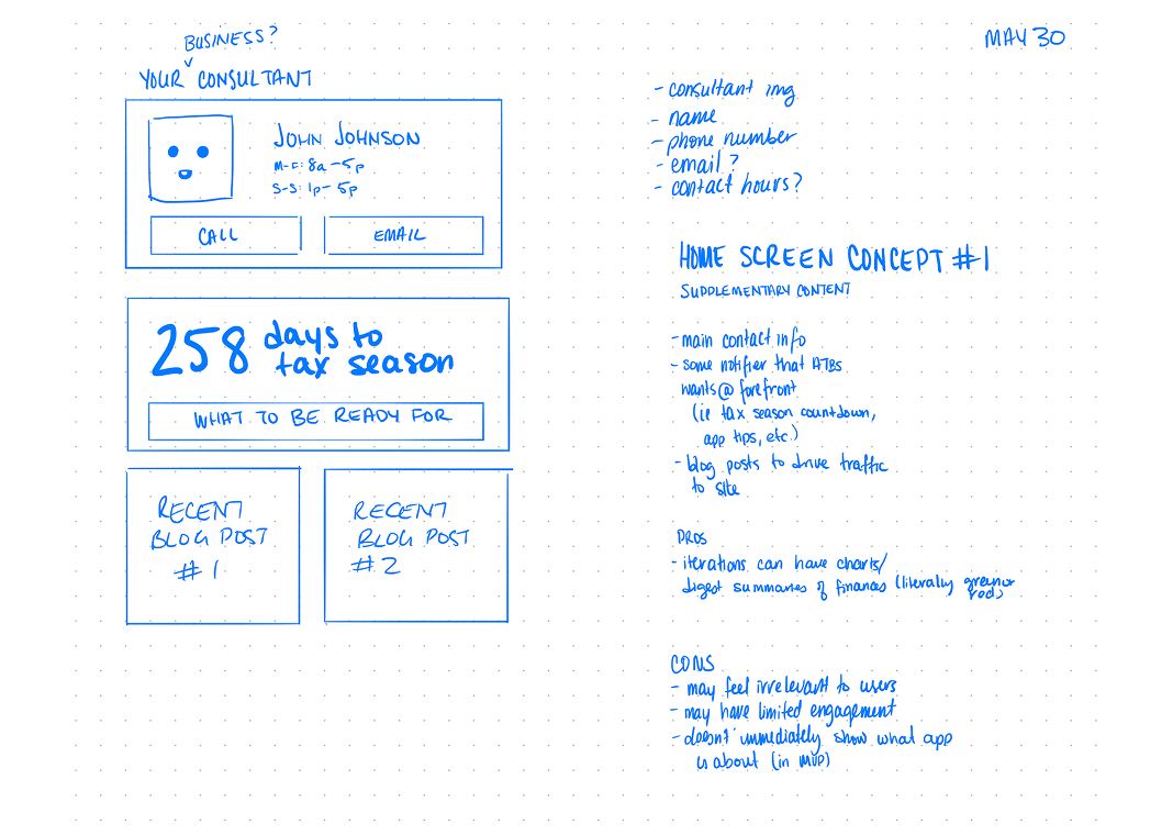
Information Architecture & User Journey
Key Insight: Truckers need a solution that works as fast as they do - minimal steps, maximum efficiency.
I mapped out the user journey focusing on three core workflows:
Quick Capture: Scan receipts immediately after purchase
Batch Processing: Upload multiple receipts during rest periods
Review & Export: Easy access for tax preparation
Wireframing & Concept Development
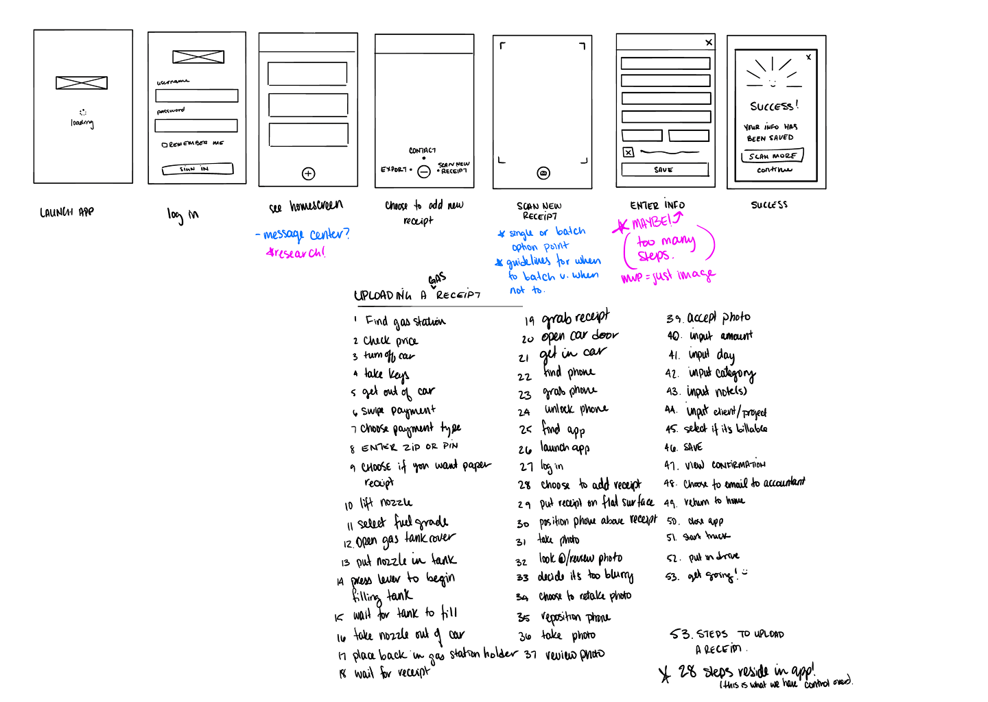
The wireframes show my iterative approach to simplifying the receipt capture process:
Launch to Success Flow:
Minimalist onboarding with clear value proposition
Single-tap access to camera functionality
Smart categorization with minimal user input
Instant confirmation and cloud backup
Key Design Decisions:
Bottom navigation: Easy thumb access while holding phone
Large touch targets: Accommodates use while wearing gloves
Minimal text entry: Leverages OCR and smart defaults
Visual feedback: Clear success states and progress indicators
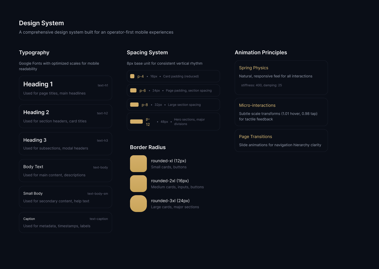
Visual Design
Highlights
High contrast for outdoor visibility
Large, readable fonts optimized for quick scanning
Simple, universally understood imagery
Essential for night driving conditions
Usability Testing
We took to the road to test our prototype. Quite literally. Myself and a couple teammates all woke up early to make the drive across Michigan to meet up at a truck stop near Detroit.
Our client was able to schedule participants for a 30 minute usability test as they were on their routes. After some frantic printing, a last-minute sourcing of an extra long power cable, and some final tweaks - we were ready. The insights? Guiding.
Many participants (6/8) typically thought about their paperwork and receipts at night, and they doubted the app could take quality photos at night.
Many participants conduct their small day-to-day admin tasks in the cabin of their trucks - a cramped situation at best.
A little under half (3/8) participants already used an app (CamScanner) to digitize some of their documents, but exporting and sending from the phone was too much of a pain for regular use.
Final Experience
Immediate Value
Skip lengthy tutorials - learn by doing
Progressive disclosure of advanced features
Contextual tips during first use
Optimized for speed and accuracy
Scan: Auto-capture when receipt is detected
Confirm: Quick visual verification
Categorize: Smart suggestions with override option
Save: Automatic cloud sync with offline queue
At-a-glance insights that matter:
YTD deduction totals
Quick access to recent uploads
Simple but powerful per diem tracker


