user flows, wireframes, testing, prototypes, interaction design, user interface designChallenge: What if your grocery retailer could learn and tailor your shopping experience? How might we transform a transactional app into a personalized shopping companion that earns—and keeps—user trust?
Translation? Take an app that people tolerated and turn it into something they actually wanted to use. While also solving for mobility issues, vision impairment, profanity in product truncations (yes, really), and a loyalty program that desperately needed love.
Meijer had an app, sure. But it was more "we have an app because we're supposed to" than "we have an app because it delights our customers." Shopping lists were clunky. Personalization was non-existent. The mPerks loyalty program was buried. And the experience felt more like a digital catalog than a helpful shopping companion.
But here's the thing: we had something a lot of projects don't get. We had time, we had access to real users, and—most importantly—we had stakeholders willing to listen.
Over time, through consistent research, transparent collaboration, and a lot of showing instead of just telling, design earned the elusive "seat at the table." We weren't just executing on handed-down requirements anymore. We were shaping ideas as they formed.
Retail e-commerce app design / Grocery shopping app UX / Personalization strategy / Accessibility-focused designLet me be real: there wasn't just one problem. There were many. Here's what we were up against:
The Problems
1. The app wasn't solving real problems
It replicated the website experience on a smaller screen. That's not mobile design—that's lazy design.
2. No personalization
Every user saw the same homepage. Your favorite products? Buried in search. Your shopping habits? Ignored. Your preferences? What preferences?
3. Loyalty program was invisible
mPerks (Meijer's rewards program) was powerful but hidden. Users didn't know they had coupons. They didn't know how to access their barcode. They definitely didn't know they could save money just by opening the app.
4. Accessibility was an afterthought
Not intentionally malicious—just not intentionally considered. And that needed to change.
5. Trust in recommendations was low
Users were skeptical of automated recommendations. "Why is it showing me this? I don't even eat seafood." Fair question.
The Approach
-
The Cadence: Biweekly Usability Testing
Every. Two. Weeks.
We ran usability studies at Meijer headquarters in Grand Rapids, Michigan with 5-7 participants per session, 45 minutes each. We recruited real Meijer shoppers through the customer team—people who actually used the app (or tried to).
The Process:
Week 1: Design iterations based on previous insights
Week 2: Test with users, take notes, observe struggles
Week 3: Synthesize findings, report insights within 2 days
Week 4: Inform the next sprint, repeat
This wasn't "validate our assumptions" research. This was "we have no idea if this works, let's find out" research. And it was glorious.
-
The technical reality check:
Challenge 1: Carousel functionality
Marketing wanted carousels. Users... tolerated them? We wrestled with:Auto-rotation (yes or no? how fast?)
Touch gestures (swipe left/right? what about accessibility?)
Indicator visibility (dots? thumbnails? how many items before it's overwhelming?)
Solution: We built multiple prototypes, tested them, and landed on a hybrid approach that balanced business needs with usability. Auto-rotation only on the hero banner, manual swipe everywhere else, clear indicators, and keyboard-navigable for accessibility.
Challenge 2: Truncation rules (or: How to avoid accidentally displaying curse words)
Product names in retail are wild. Long, inconsistent, sometimes profane when truncated.
Real example (paraphrased to keep this professional): A cleaning product with an unfortunate truncation that... yeah, we couldn't ship that.
Solution: Dynamic truncation rules based on character count and whole-word breaks. QA testing with real product database. Fallbacks for edge cases. And a lot of laughter during review sessions.
Challenge 3: Inconsistent product images
Some products had beautiful high-res images. Some had grainy stock photos. Some had nothing.
Solution: Designed for the worst-case scenario (no image) and made it look intentional. Placeholder states with brand colors and iconography. Lazy loading for performance. And a lot of advocating to the product team to prioritize image quality.
Challenge 4: mPerks needed engagement
The loyalty program was powerful but underutilized. Users didn't clip coupons. They forgot their barcode. They didn't realize they were missing savings.
Solution:
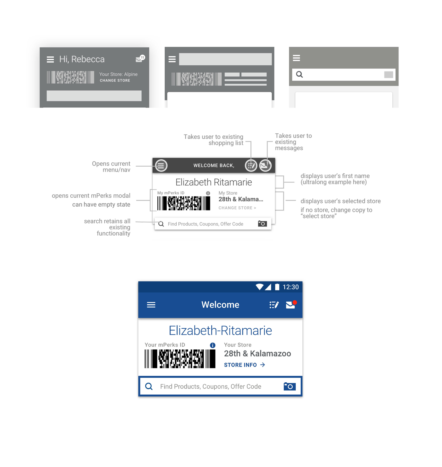
Moved mPerks ID barcode to the homepage (one tap away, always)
Surfaced relevant coupons in context (browsing cereal? here's a cereal coupon)
Added notifications for expiring rewards
Designed a playful "You saved $X this trip!" celebration moment
-
The personalization problem:
Users were skeptical. "Why is it recommending this?" "Is it just trying to upsell me?" "I don't trust this."
We needed to make recommendations feel helpful, not creepy. Transparent, not algorithmic. Playful, not pushy.
Our approach:
1. Contextual suggestions based on shopping list
"Inspired by your list" showed items that complemented what they were already buying. Making tacos? Here's salsa, cheese, and tortillas. Not interested? Scroll past. No judgment.2. Easy dismissal and learning
Every recommendation had a small "x" or "not interested" option. And we learned from it. Dismissed seafood three times? We stopped suggesting it.3. Playful copy and visuals
Instead of "Recommended for you" (boring, corporate), we tested phrases like:"You might also need..." (helpful)
"Inspired by your list" (contextual)
"Customers also bought..." (social proof)
"On sale this week" (value-driven)
Users responded best to contextual and value-driven language. Noted.
4. Celebrating moments
When users clipped a coupon, we added a subtle animation and confirmation. When they completed their shopping list, we celebrated it. Small moments of delight go a long way. -
How we built trust with stakeholders:
1. Showed our work early and often
We didn't wait for polished designs. We shared sketches, wireframes, messy prototypes. We invited feedback before we were attached to solutions.2. Brought stakeholders to usability testing
Product managers, engineers, business stakeholders—we invited them to watch users struggle (and succeed). Seeing real people use (or fail to use) their ideas was more convincing than any deck.3. Reported insights fast
Within two days of testing, we delivered a concise report:What we tested
What we learned
What we recommend changing
What's working (celebrate wins!)
Speed mattered. Insights informed the next sprint.
4. Spoke in outcomes, not features
Instead of "we need a bigger button," we said "users with mobility challenges can't tap this—let's fix it so everyone can use it."Instead of "carousels are bad UX," we said "users are scrolling past the carousel—let's test a static layout and measure engagement."
The result?
Design was invited to roadmap planning. We shaped ideas early. We influenced prioritization. We became partners, not order-takers.
Research-Informed Design Principles
Discovery 1: Accessibility isn't optional
We had users with mobility challenges who couldn't tap our tiny touch targets. We had users with vision impairment who couldn't read our "perfectly fine" font sizes or distinguish our color palette. These weren't edge cases—these were our customers.
One participant told us, "I bring my daughter shopping with me because I can't see the prices on the app." That hit different.
Immediate changes:
Increased touch target sizes to meet accessibility guidelines (minimum 44x44pt)
Redesigned color palette with WCAG AA contrast ratios
Increased font sizes and improved hierarchy
Added support for dynamic type (iOS) and font scaling (Android)
Discovery 2: Shopping list behaviors revealed personalization philosophy
We thought shopping lists were simple. Add item. Check off item. Done.
Users showed us we were wrong.
Some users organized by aisle. Some organized by meal. Some shared lists with family members. Some wanted to add items by voice while cooking. Some wanted suggested items based on past purchases.
The insight? Personalization isn't about us deciding what's relevant—it's about learning from user behavior and giving them control.
This fundamentally shaped our entire personalization approach:
Don't force recommendations—suggest them playfully
Let users teach the system what they like
Respect shopping patterns and preferences
Make it easy to ignore suggestions (and learn from those rejections)
Discovery 3: Language matters more than we thought
We'd categorize sections one way. Users expected something completely different.
"Frequently Bought" felt robotic. "Your Favorites" assumed we knew better than they did. But "Inspired by your list"? That felt helpful, not presumptuous.
We iterated on copy, tested it, iterated again. Every label. Every button. Every helper text. If users hesitated or looked confused, we tried something else.
The Experience We Shipped
Home Screen Redesign
Evaluated existing features to identify the most relevant info:
mPerks ID barcode (one-tap access—finally!)
Shopping list quick-add
Personalized recommendations ("Inspired by your list")
Weekly ad and sale highlights
Quick access to categories and search
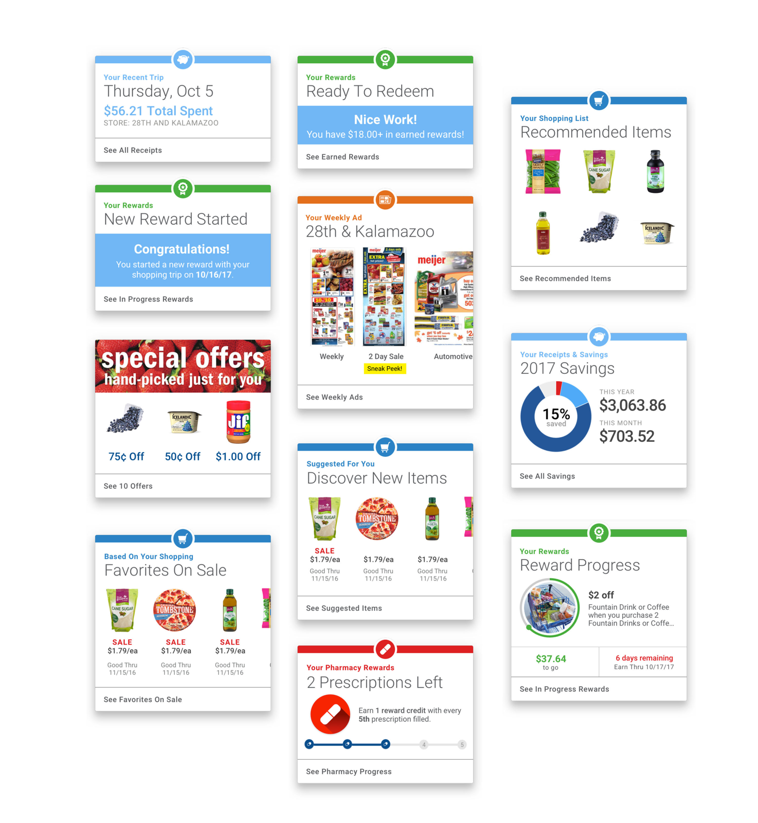
Card structures designed for flexibility:
Consistent visual hierarchy
Scannable layout
Clear actions (tap, swipe, dismiss)
Responsive to different content types
Personalization Features
Recommended items based on:
Shopping list contents
Past purchase behavior
Seasonal trends
Store location and inventory
User control:
Easy dismissal
"Not interested" feedback
Transparent explanations ("Based on your list")
Accessibility Improvements
What we implemented:
WCAG AA contrast ratios across all text and UI elements
Minimum 44x44pt touch targets
Dynamic type support (iOS) and font scaling (Android)
Keyboard navigation for all interactive elements
Screen reader optimization with semantic labels
High-contrast mode support
Reduced motion options
Impact:
These weren't "nice to haves"—they were foundational. And users noticed.
Outcomes & Impact
App Store Performance
The numbers tell part of the story:
Apple App Store:
Late 2017: 2.8 stars (18,000+ ratings)
Late 2018: 4.6 stars (45,000+ ratings)
Rating increase: +64% improvement
Google Play Store:
Late 2017: 3.2 stars (12,000+ ratings)
Late 2018: 4.4 stars (28,000+ ratings)
Rating increase: +37.5% improvement
User Review Themes (Improved):
"Finally easy to find my coupons!"
"Love the shopping list suggestions"
"So much better than before"
"Actually useful now"
Engagement Metrics
While specific internal metrics are proprietary, publicly available data shows:
mPerks program grew to 2+ million active users by late 2018
Mobile app downloads increased 40%+ year-over-year
Mobile transactions as percentage of digital sales increased significantly
Qualitative Impact
What users told us:
"I can actually use this app now." (Vision-impaired participant)
"The suggestions are actually helpful—not annoying." (Weekly shopper)
"I didn't know I had coupons until they showed up on my list!" (Infrequent mPerks user)
What stakeholders told us:
"You've changed how we think about mobile."
"We trust design to guide these decisions now."
"Can you help us with [other project]?"
That last one? That's the real win. Trust earned.


